The power of advertising and packaging
In the twentieth century, people began to notice advertisements and product packaging, which were intended to encourage their purchase. Modern entrepreneurs started to notice that sometimes the high quality of their items was insufficient to provoke significant interest. This was especially true for new products on the market, such as pharmaceuticals, cleaning supplies, and cosmetics. First and foremost, one had to persuade customers that they needed a given product because it would facilitate performing daily activities or positively influence their health.
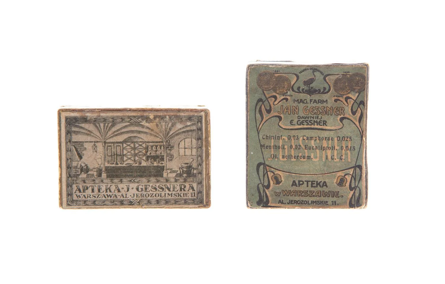
Prewar product packaging also tells you a lot about the style of the era. It was a time when the profession of the graphic designer was still in its infancy, and thus many of the authors of label illustrations remain unknown.
"Boxes, cans, and packaging paper are also a reflection of the tastes and preferences of the eras in which they were made; they are examples of design concepts that were popular at a particular time. The aesthetic value of packaging constituted a crucial issue, as one of its most important functions was to effectively communicate information about the product and encourage its purchase." " -
- Lena Wicherkiewicz, "Kolekcja opakowań w Muzeum Warszawy", p. 287
The design of labels and advertisements has to be in line with the fashions of the times in order to attract consumers' attention. Therefore, it was popular to use floral motifs, wavy lines, or ornaments inspired by oriental art, which corresponded with the Art Nouveau style at the beginning of the 20th century. As art déco emerged, illustrations began to be dominated by simple framing and geometrical forms. In addition to attractive packaging, each product had to arouse interest in press advertisements. Attractive typography (bold fonts, large-size headings, italics), or frames made of straight lines or geometric shapes, helped draw customers' attention. Advertisements were often accompanied by illustrations, complementing catchy slogans.
Lucyna Ćwierczakiewiczowa, „ 365 obiadów”, Warsaw 1907
„Kurjer Polski”, R. 40 (25.04.1937), no. 113, p. 7
One can tell that prewar marketers did not regard any subject as taboo when you look at the slogans that promoted various goods, particularly pharmaceutical drugs. Products for treating baldness, scars, wrinkles, freckles, and other conditions were heavily promoted.
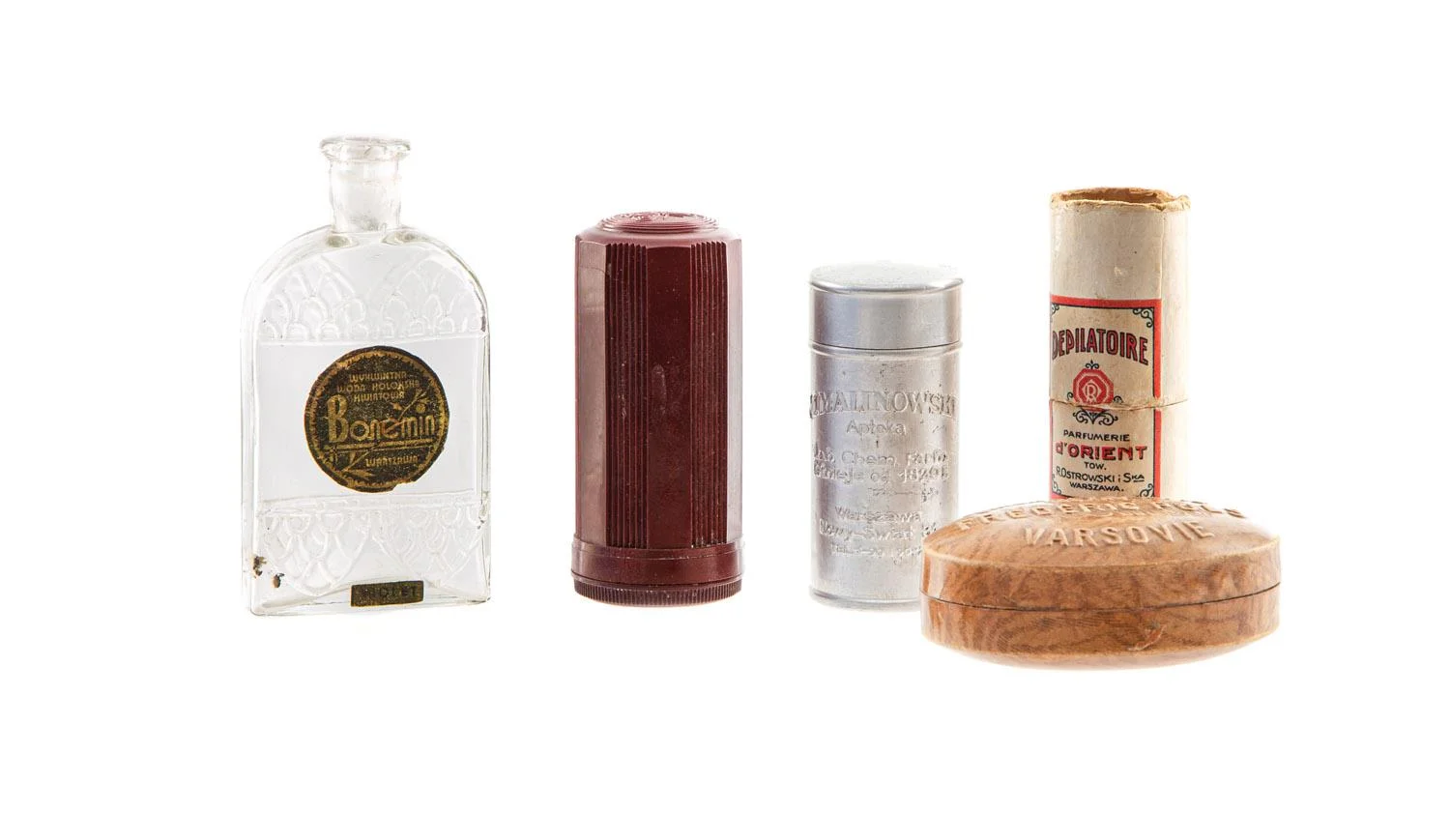
One of the most advertised products included cosmetics. After the economic, social, and cultural transformations that took place after the Great War, women had to balance work with taking care of the household. Time-consuming beauty procedures became less popular as a result. They were replaced by cosmetics designed to meet the different needs of the skin. After all, "the joy of life is beauty," according to one of the advertising slogans of Marian Malinowski's factory of medical and cosmetic products. In the beginning, Marian Malinowski ran a pharmacy and a chemical laboratory on Warsaw's Nowy Świat Street. Malinowski's signature items were therapeutic soaps sold to drugstores, pharmacies, and hospitals across Poland. Products made by Malinowski's lab were praised for their exceptional quality as well as their visually appealing packaging:
The company's products also deserve recognition for their well-crafted and aesthetically pleasing packaging that can compete with the most beautiful packaging of foreign luxury goods." -
- "Kurjer Polski", R. 40, no. 113, 25 April 1937, p. 8.
Powder Box Set
„Kurjer Polski”, R. 40 (25.04.1937), no. 113, p. 3
Using soap and cream was one of the most fundamental skincare routines, and applying the powder was the most crucial step when putting on makeup. The most popular products included goods by PULS company, which were advertised with, among other things, slogans saying "The mother's skin is as delicate as the baby's skin thanks to our URODA powder." PULS was established by Fryderyk Puls in the 19th century, and similar to many cosmetic companies operating in the interwar period, it started with the production of soap. Following the launch of soaps, PULSE expanded its product line with oral care, cosmetics, fragrance, make-up, and products for hands, face, and hair. The luxury goods produced by this company were of the highest quality, winning certificates and gold medals at international contests.
„Kurjer Warszawski”, R. 117 (24.12.1937), no. 353,p. 3
„Bluszcz”, 26.05.1936, no. 21, p. 629
The design of packaging had gradually seen a significant shift as a result of the engagement of designers. Packaging's design and functionality gained equal importance to compositional elements like color, pattern, and typographic arrangements that reflected the object's nature and function.